Excited to Showcase Bison Janitorial’s New Brand Identity!
We are so proud of our latest rebranding project – Bison Janitorial.
As Bison Janitorial continues to extend it’s foothold as Winnipeg’s customer focused Commercial Cleaning Service while moving into the “green” generation, it was important to create a visual which clearly identified their service offering.
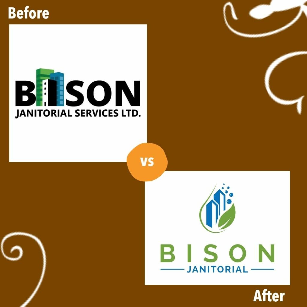
The original logo focused on the commercial aspect of the business featuring high rise buildings. The new logo features symbolically stylized elements of commercial and cleanliness incorporating building to represent commercial, a leaf to showcase their commitment to the green initiative and bubbles to show the clean outcome of their services. Utilizing the same family of colors allowed us to create some symmetry to the original logo maintaining familiarity.
When it comes to brand identity, I’ve always strongly felt it should be clean, easy to read and most importantly clearly shows what the business offers in regards to products or services. This logo can be read from a distance and the icon displays the key elements in an easy to view manner.

Looking at the before and after, we’re really looking forward to rolling out the new brand for Bison Janitorial and showcasing it to Winnipeg and the surrounding areas.
What are your thoughts?
